

Building strong communities
Westchase Creek Apartments
Sign Makeover
Vestibulum ante ipsum primis in faucibus orci luctus et ultrices posuere cubilia Curae. Aenean eu justo sed elit dignissim aliquam. Lorem ipsum dolor sit amet, consectetur adipiscing elit. Read More

Cedar Bluff Apartments
Vestibulum ante ipsum primis in faucibus orci luctus et ultrices posuere cubilia Curae. Aenean eu justo sed elit dignissim aliquam. Lorem ipsum dolor sit amet, consectetur adipiscing elit. Read More

Bridle Creek
Subdivision
Vestibulum ante ipsum primis in faucibus orci luctus et ultrices posuere cubilia Curae. Aenean eu justo sed elit dignissim aliquam. Lorem ipsum dolor sit amet, consectetur adipiscing elit. Read More
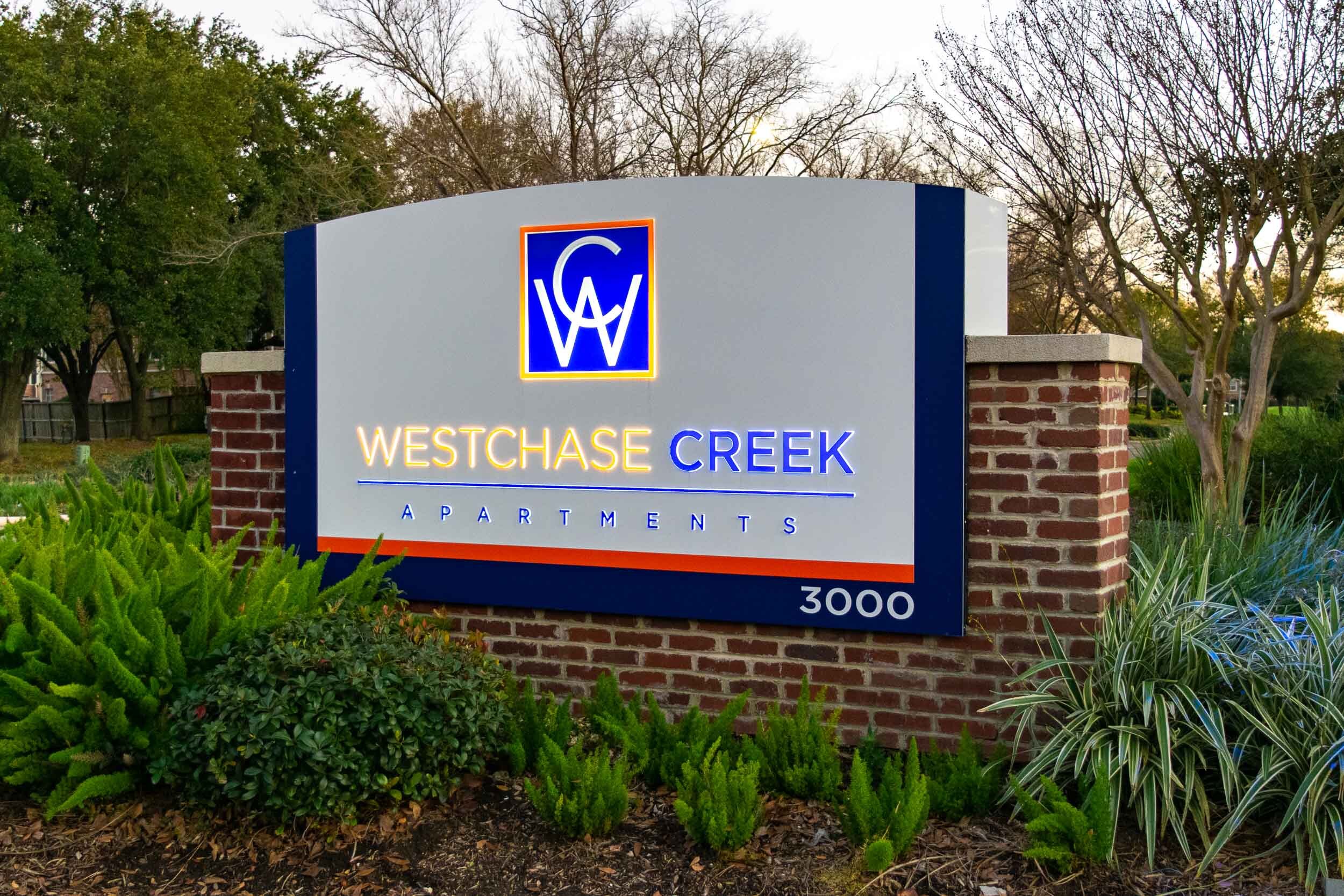
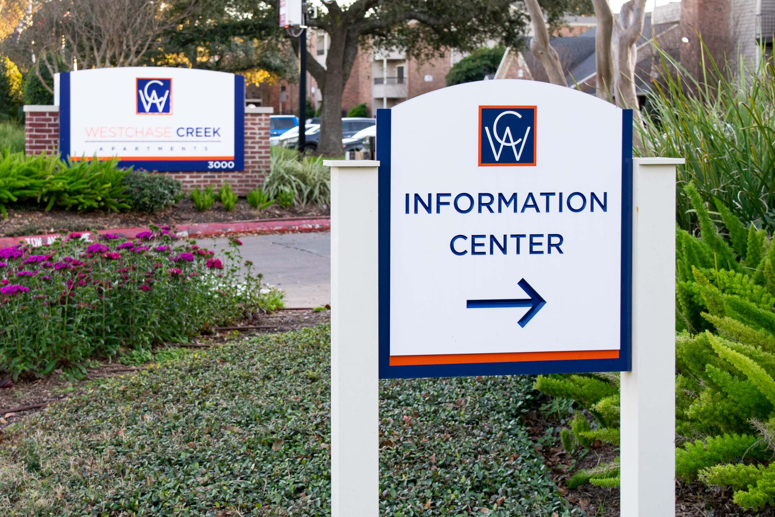
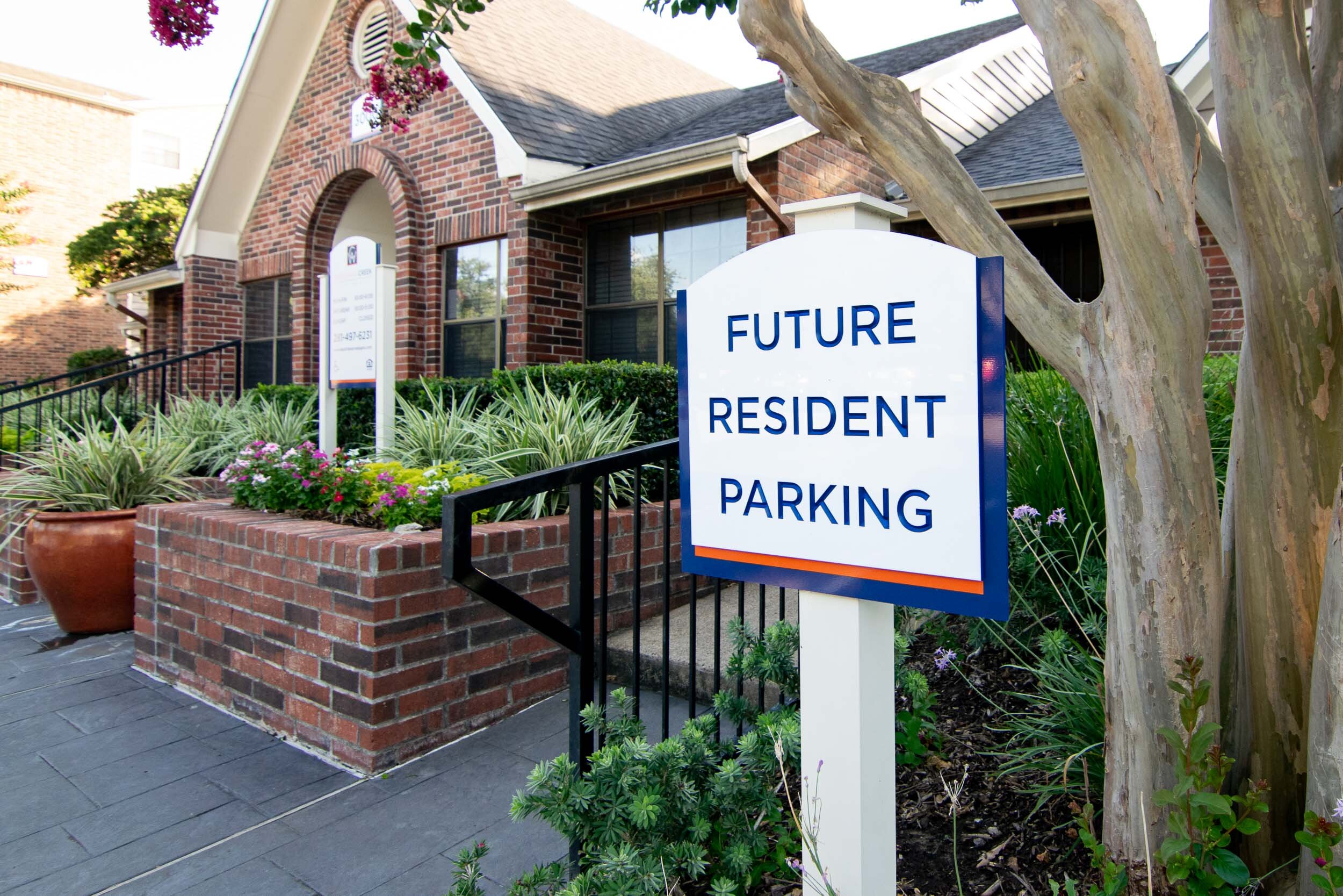
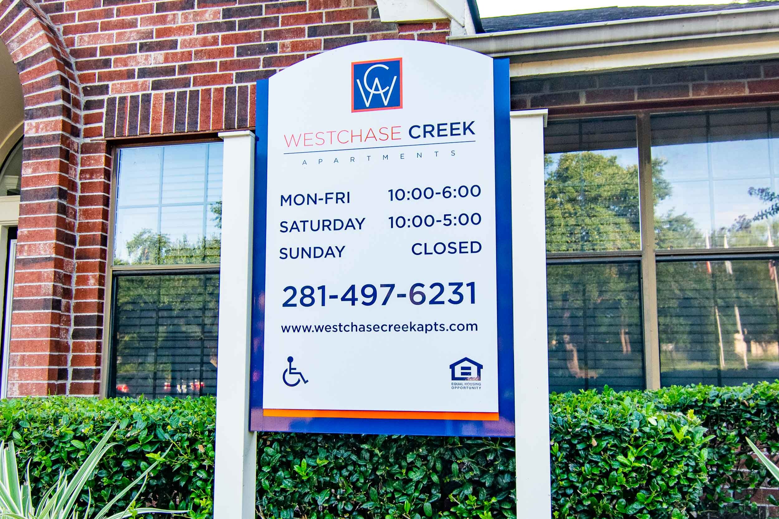
The Cost-Effective Way to Update Your Brand? Refurbish Existing Assets
Westchase Creek Apartments Secures Fresh Look for In-Place Signage

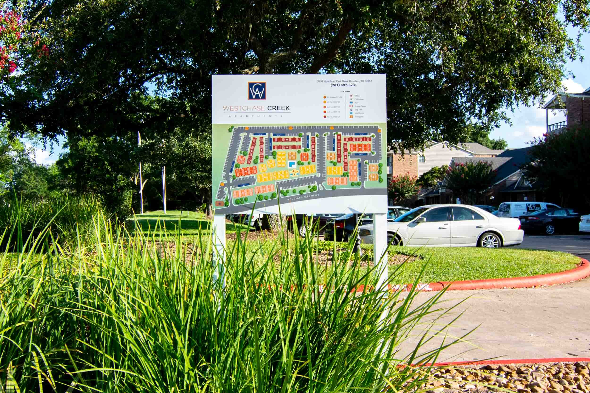


Located in West Houston, Westchase Creek Apartments boasts a range of amenities, including a fitness center, clubhouse, picnic area, and an onsite dog park. Apartments.com users rate the complex as 4 out of 5 stars, garnering a “Great” rating. Veritas Equity Management had just become the new owner of the complex, and wanted to give the community a visual facelift--implementing the new logo and branding colors--while taking advantage of the complex's existing assets where possible.
Veritas contacted a few sign companies to help with the implementation, but after several weeks of unresponsiveness, the president of the company, John Boriack, couldn’t wait any longer. He contacted the Houston Apartment Association (HAA) for a sign company referral--that’s how he found Saifee Signs. He asked us to come up with a sign package design concept, which we did within one week.
Signage is crucial for branding!
Beautiful, fresh, updated signage has multiple benefits for apartment complexes—it’s more visible and appealing to passers-by; it makes a great first impression; it solidifies brand identity; and it adds to a premium aesthetic that can attract new tenants and validate higher rent. Upgrading Westchase Creek’s existing signage with premium elements was the ideal solution for a cost-effective rebrand.
One-stop shop for creative design, engineering, and execution
One of our unique attributes is that we comprise everything it takes for flawless brand implementation: from in-house creatives with art degrees, to tradesmen with a passion for craftsmanship and artistry, to customer service professionals whose mission is our clients’ happiness. Together, we formed the “one-stop shop” Westchase Creek needed to meet its goals.
Our work, step by step
First, we consulted with Westchase Creek Apartments’ new owner to better understand their goal for this project and to outline the scope of work—from initial design concepts to final delivery and installation. We even handled all city permitting for the signage, which can be an exercise in red tape and bureaucracy for property owners.
Then, we set out to value engineer a sign solution that would accentuate existing aspects while looking like a completely brand-new asset. Beginning with the street-level sign at the entrance of the property, we kept the masonry work and internal LED lighting but completely reworked the face of the sign. Detailed photographs were taken to make a cutting template. Then, CNC routing was used to precisely cut the new aluminum faces to the exact shape of the existing sign faces. The new Westchase Creek logo was integrated into the sign design, and the face was routed to support ⅜-inch raised push-through acrylic letters. Push-through letters added dimension, and the translucent colored vinyl on the top combined with the raised white edges added pop to the overall sign, especially when it is lighted at night.
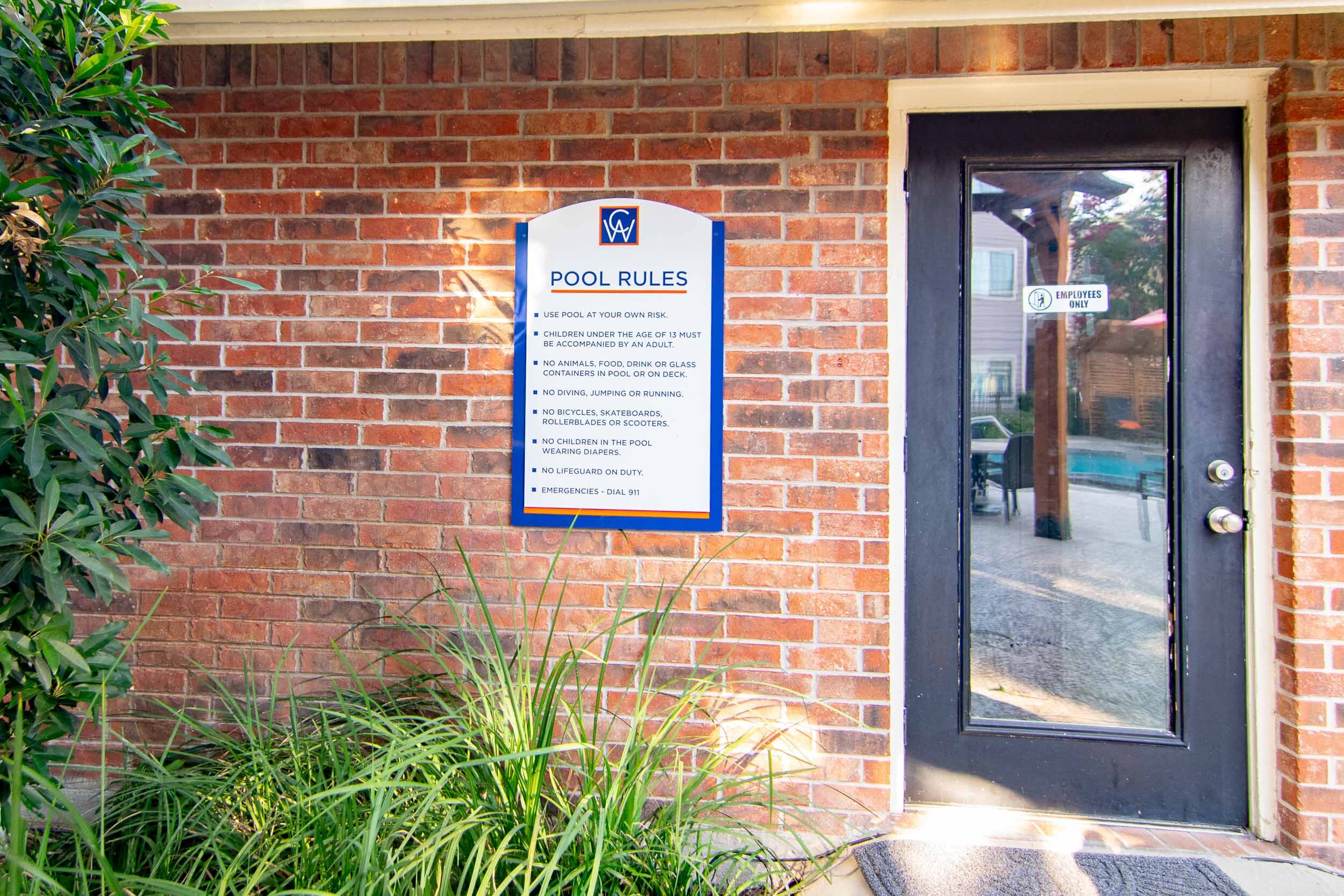
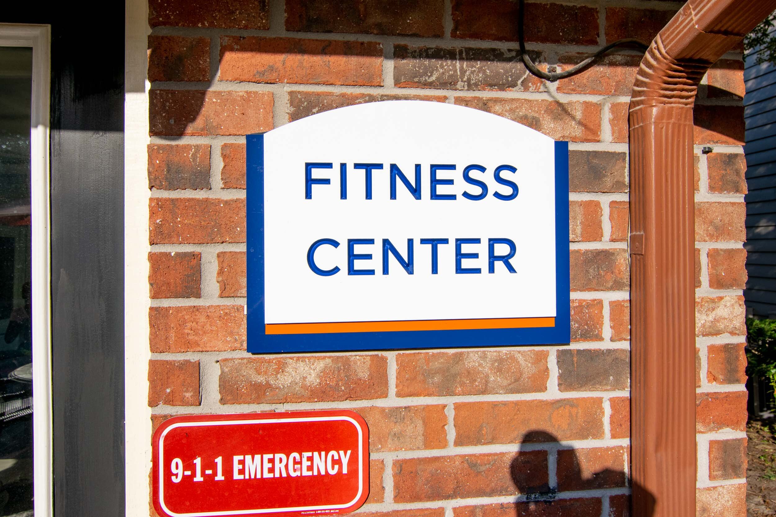
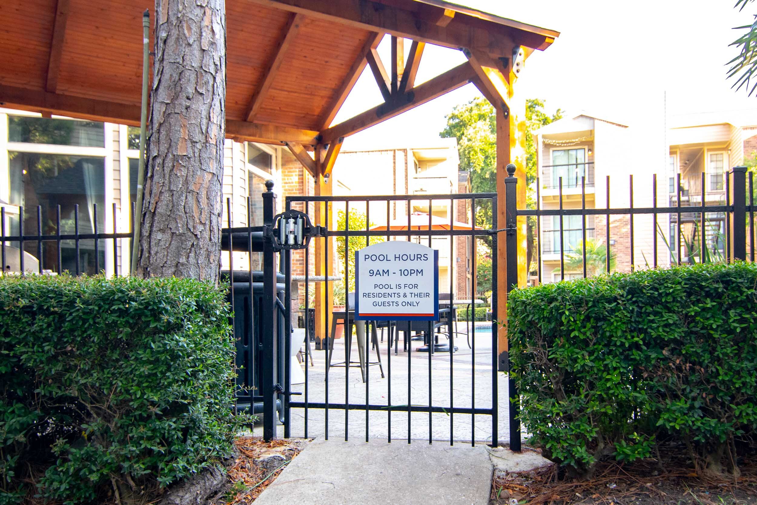
To give it all a cohesive branded look, we also added new sign faces to the existing building numbers, directional signs, amenity signs, and much more. A special durable bright-white acrylic was used for the front-facing signs to give them a premium look. The text and directional arrows on these were CNC-engraved, then paint-filled with automotive grade acrylic polyurethane paints for longevity.
Happy customer means a job well done
Through our collaborative approach, creative design, artistic craftsmanship, and passion for quality, Veritas received a like-new brand experience in its updated signage. Ruha Vohra, Community Director at Veritas Equity Management, rated our work as “beautiful and high quality,” adding that our customer service was “excellent and prompt.”
Cedar bluff apartments
Lorem ipsum dolor sit amet, consectetur adipiscing elit. Proin bibendum sodales semper. Nam luctus metus at consectetur feugiat. Proin convallis iaculis dui non maximus. Morbi eleifend dignissim imperdiet. Duis varius finibus venenatis. Duis sit amet condimentum nunc. Integer tristique tortor in arcu vulputate, quis scelerisque ex ullamcorper. Vivamus odio enim, lobortis mattis congue aliquam, malesuada at leo.